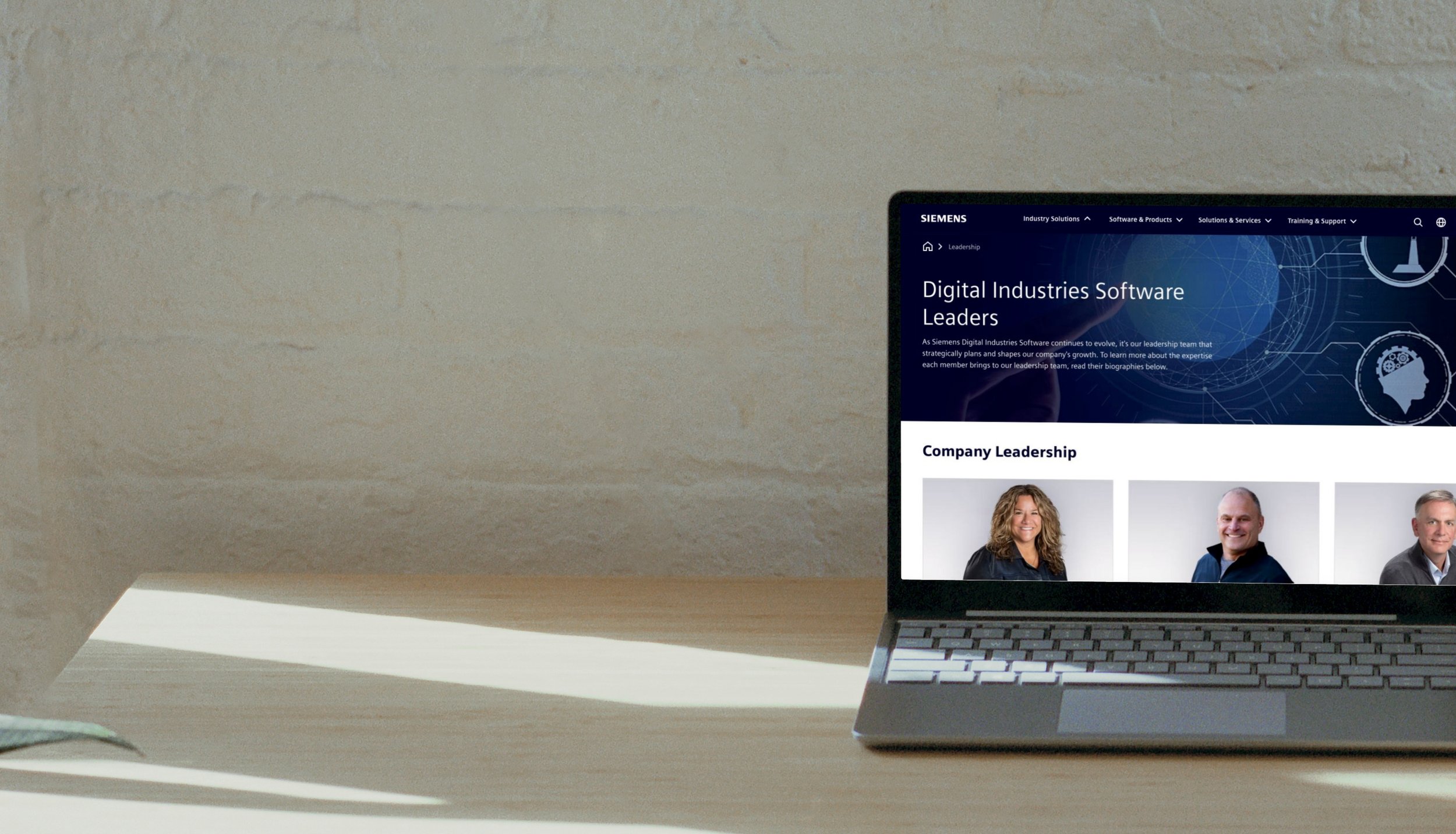
Enterprise Website Redesign | UX Design & Research
Increasing revenue by 15% through an intuitive enterprise marketing site
Company Info
Fortune Global 50 Manufacturing Software Company — Enterprise | $5B+ revenue
Role
UX Researcher & Designer
Team
1 other UX Designer, 1 Product Manager, 1 Development Lead, 5 Software Developers
Duration
Ongoing initiative
Results / Impact
Increase in revenue and customer findability of company products to 45%, a 15% increase from previous years.
The online Community saw more questions answered in the forums, an increased 7% in FY 23 Q2 and 5.6% in Q3.
Received internal award for design work on Newsroom—Siemens Software HIT Award for exemplary collaboration and innovation, FY2023.
C-Suite decided all division websites needed to be a consistent experience by bringing user interfaces into brand compliance while focusing on increasing usability and findability of information that customers historically claimed they couldn’t find.
This Fortune Global 50 Software company’s marketing website saw upwards of 24.3 million visitors in fiscal year 2023 which was an increase in revenue and customer findability of company products to 45% from previous years due to the design work I supported.
In addition to initial design work, I championed and conducted several quick, tight cycles of research and design iterations for several key pages of the marketing website for on-premise and SaaS products.
Project Overview
Customers claimed not to be able to find the information they were looking around 70% of the time.
A site intercept survey on the marketing site showed 70% of survey respondent were confused by “fluff content” and were unable to find the product information they sought. With my redesigns—focusing on the company’s transition to SaaS-based products—I got that 30% of customers who said they found what they were looking for up to 45%.
Key pages I led research & redesign on include: Community, Newsroom, Leadership, Academics, the Chat feature, and even Interactive Voice Response (IVR) phone tree.
Competitive Research
Once it was clear that findability of the site pages was low, I looked at how competitors display their product information
First thing was to check out competing Manufacturing Software Company sites' similar pages. While it’s important to understand what competitors are doing affects how customers see a companies products, it’s also vital to understand that competitors’ customers are not always The Company’s customers. (Just because Apple customers love their e-commerce walkthrough doesn’t mean it will do the same thing for The Company’s customers.) Getting inspired by comparable competitors’ sites and features can still provide value.
For the Contact Us page, and Chat and IVR experiences, I sought to identify areas of improvement in regards to industry best practices.
Constraints & Limitations
What would I do differently?
Throughout my three years at The Company, I was on and off the Redesign / “Great Migration” of the site to a new platform.
My next step was going to be conducting qualitative research with customers on the Interactive Voice Response (IVR) phone tree system to identify areas of improvement. I had already conducted desktop research to identify best practices and made improvement recommendations.
While I understood the business case for the redesign, I would like to have been more involved in the business strategy, making an even greater impact on the product roadmap of the marketing site.
